Establishing content design case study
GRIN’s new content style guide. ✨
Summary
Witness the development of a transformative company-wide style guide, content strategy, and content audit at GRIN, streamlining content creation and user experiences. GRIN is the #1 creator management platform with thousands of users and $21 million ARR.
Role: Content Designer (project lead)
Timeline: 1 month
Tools: Figma, Miro, Fullstory, Google Analytics, Dovetail, Jira, Confluence
Team:
Christine Siu - Product Designer and Design System Lead
Quinn Schwartz - Marketing Copywriter
Abby Cho - Technical Writer
Problem
GRIN’s creator management platform lacked user guidance and content consistency. As a result, users frequently gave feedback that GRIN was “too complex” and took weeks to learn.
As GRIN’s first Content Designer, I collaboratively established the following content design foundations in my first 60 days during leadership changes:
Content style guide (included in design system)
Content strategy
Content audit
Research
I led this project and collaborated with product, CS, engineering, marketing, and education.
Research steps and insights included:
Located existing assets including a marketing guide, the design system in Figma, and a UX audit.
Insight: I could build off existing assets.Found a central location for the style guide and got leadership buy-in.
Insight: A central location ensured everyone was empowered to write and speak as one company.Led collaboration sessions with key collaborators in content, design, and engineering roles.
Insights: Some terminology and processes were confusing and didn’t align with users’ mental models.Conducted user research including user interviews, Full Story, Google Analytics, and customer service data.
Insights: Users needed more in-app guidance, consistency, and simplified information architecture and user flows to learn and use GRIN quickly. Many issues escalated to CS were avoidable.
Design and iteration
Here’s how I developed these assets and got the whole company on board.
Content style guide and design system
I led the collaborative development of GRIN’s content style guide by creating a prototype and leading a cross-functional workshop to develop it. The style guide includes a brand glossary I created with GenAI that ensures that GRIN’s content matches its users’ mental models.
Terminology changes impact multiple areas of the business, so I solicited feedback from all areas and reviewed change recommendations with VPs.
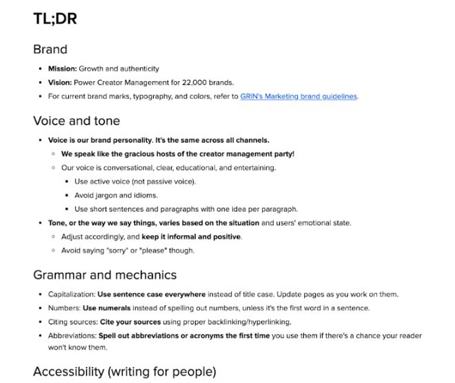
Part of the TL;DR page in the content style guide.
After teaching the company about the style guide in all-hands meetings, everyone got access. Engineering added it to GRIN’s new design system.
Design system component guideline example.
Content audit
I added a content audit to the team’s existing UX audit in Figma and presented prioritized change recommendations to leadership. This included information architecture, navigation, UX writing, etc.
Content strategy
I hosted 2 cross-functional content strategy design sessions in Miro. This included presenting about content strategy and leading whiteboarding sessions to develop GRIN’s content strategy.
Content writing workshops
I created and presented 2 hands-on content workshops in Miro about user-centered content. These workshops empowered others in the business to write user-centered and as one brand.
Results
Key results included:
The whole business started using the content style guide and design system. They’re developing user-centered content faster.
GRIN speaking with a unified voice and customer messaging. Their tone is situationally appropriate.
We aligned GRIN’s terminology with users’ mental models, including in GRIN’s redesigned navigation.
Optimizing GRIN’s content for accessibility, making it easier for everyone to use and expanding their potential market.
Unfortunately, GRIN experienced a turbulent time and laid me off in a mass layoff after six months and an excellent review (check out reviews on LinkedIn!).
Fortunately, I developed these assets in public and collaboratively so their value lives on.
Here’s proof:
“I plan to carry on supporting the style guides you developed—they are much needed!”
— Aeron Terry, Manager of Customer Experience @ GRIN
“[Dez] played a crucial role in shaping how we approach content design and developed our content strategy from the ground up. She collaborated cross-functionally with all departments to make sure she understood what she was working with before diving head first into creating this set of rules that would have a lasting impact on the way we think about content.
Having this style guide on hand has added immense value to my design process and it’s something I reference often.”
— Christine Siu, Senior Product Designer @ GRIN
“The suggestions she provided were quick, easy, and actionable. They facilitated cross-departmental alignment while having a direct and immediate impact on improving user experience.”
— Abby Cho, Senior Technical Writer @ GRIN


